
Design System
The tokens, components, and motion rules behind hiaustin.co. Toggle the footer theme to compare light and dark.
Color
All 39 semantic and brand tokens in OKLCH. Toggle the footer theme to compare light and dark.
Brand Palette
Six accent hues. Primary maps to green; destructive aliases red.
Green
brand-green
Yellow
brand-yellow
Orange
brand-orange
Purple
brand-purple
Blue
brand-blue
Red
brand-red
Neutral Scale
Warm paper surfaces and ink foreground. Surfaces stack from background through surface-3.
Background
background
Surface 1
surface-1
Surface 2
surface-2
Surface 3
surface-3
Muted
muted
Border
border
Foreground
foreground
Core
Background
background
bg-background
light oklch(0.975 0.007 95)
dark oklch(0.184 0.005 85)
Foreground
foreground
bg-foreground
light oklch(0.208 0.006 85)
dark oklch(0.936 0.017 95)
Surfaces
Card
card
bg-card
light oklch(0.955 0.011 95)
dark oklch(0.219 0.006 85)
Card Foreground
card-foreground
text-card-foreground
light oklch(0.208 0.006 85)
dark oklch(0.936 0.017 95)
Popover
popover
bg-popover
light var(--surface-2)
dark var(--surface-3)
Popover Foreground
popover-foreground
text-popover-foreground
light var(--foreground)
dark var(--foreground)
Muted
muted
bg-muted
light oklch(0.916 0.011 92)
dark oklch(0.274 0.007 85)
Muted Foreground
muted-foreground
text-muted-foreground
light oklch(0.5 0.013 85)
dark oklch(0.717 0.022 95)
Surface 1
surface-1
bg-surface-1
light oklch(0.975 0.007 95)
dark oklch(0.184 0.005 85)
Surface 2
surface-2
bg-surface-2
light oklch(0.941 0.012 95)
dark oklch(0.219 0.006 85)
Surface 3
surface-3
bg-surface-3
light oklch(0.887 0.015 90)
dark oklch(0.274 0.007 85)
Interactive
Primary
primary
bg-primary
light oklch(0.747 0.206 133)
dark oklch(0.834 0.22 132)
Primary Foreground
primary-foreground
text-primary-foreground
light oklch(0.197 0.006 85)
dark oklch(0.197 0.006 85)
Secondary
secondary
bg-secondary
light var(--surface-2)
dark var(--surface-2)
Secondary Foreground
secondary-foreground
text-secondary-foreground
light var(--foreground)
dark var(--foreground)
Accent
accent
bg-accent
light oklch(0.58 0.24 298)
dark oklch(0.72 0.22 300)
Accent Foreground
accent-foreground
text-accent-foreground
light oklch(0.975 0.007 95)
dark oklch(0.197 0.006 85)
Destructive
destructive
bg-destructive
light var(--brand-red)
dark var(--brand-red)
Destructive Foreground
destructive-foreground
text-destructive-foreground
light oklch(0.975 0.007 95)
dark oklch(0.936 0.017 95)
Borders & Focus
Border
border
border-border
light oklch(0.84 0.016 88)
dark oklch(0.346 0.008 85)
Border Subtle
border-subtle
border-border-subtle
light color-mix(in oklch, var(--border) 60%, transparent)
dark color-mix(in oklch, var(--border) 60%, transparent)
Input
input
border-input
light oklch(0.84 0.016 88)
dark oklch(0.346 0.008 85)
Ring
ring
bg-ring
light oklch(0.747 0.206 133)
dark oklch(0.834 0.22 132)
Brand
Brand Green
brand-green
bg-brand-green
light oklch(0.747 0.206 133)
dark oklch(0.834 0.22 132)
Brand Yellow
brand-yellow
bg-brand-yellow
light oklch(0.833 0.161 83)
dark oklch(0.84 0.149 85)
Brand Orange
brand-orange
bg-brand-orange
light oklch(0.705 0.176 50)
dark oklch(0.723 0.161 52)
Brand Purple
brand-purple
bg-brand-purple
light oklch(0.58 0.24 298)
dark oklch(0.72 0.22 300)
Brand Blue
brand-blue
bg-brand-blue
light oklch(0.60 0.20 250)
dark oklch(0.72 0.18 250)
Brand Red
brand-red
bg-brand-red
light oklch(0.57 0.198 30)
dark oklch(0.634 0.176 29)
Utility
Grid Line
grid-line
border-grid-line
light oklch(0.84 0.016 88)
dark oklch(0.346 0.008 85)
Glow
glow
bg-glow
light oklch(0.747 0.206 133)
dark oklch(0.834 0.22 132)
Sidebar
Sidebar
sidebar
bg-sidebar
light var(--surface-2)
dark var(--surface-2)
Sidebar Foreground
sidebar-foreground
text-sidebar-foreground
light var(--foreground)
dark var(--foreground)
Sidebar Primary
sidebar-primary
bg-sidebar-primary
light var(--primary)
dark var(--primary)
Sidebar Primary Foreground
sidebar-primary-foreground
text-sidebar-primary-foreground
light var(--primary-foreground)
dark var(--primary-foreground)
Sidebar Accent
sidebar-accent
bg-sidebar-accent
light var(--surface-3)
dark var(--surface-3)
Sidebar Accent Foreground
sidebar-accent-foreground
text-sidebar-accent-foreground
light var(--foreground)
dark var(--foreground)
Sidebar Border
sidebar-border
border-sidebar-border
light var(--border-subtle)
dark var(--border-subtle)
Sidebar Ring
sidebar-ring
bg-sidebar-ring
light var(--ring)
dark var(--ring)
Radius
All radius aliases resolve to the 2px base token.
Preview
0px — Sharp
For Comparison Only
2px — Base
var(--radius)
All Tailwind radius utilities (rounded-sm through rounded-xl) currently resolve to the same 2px base token.
Aliases
Base · rounded-lg
--radius
2px
Small · rounded-sm
--radius-sm
var(--radius)
Medium · rounded-md
--radius-md
var(--radius)
Large · rounded-lg
--radius-lg
var(--radius)
Extra Large · rounded-xl
--radius-xl
var(--radius)
Typography
Geist Sans and Mono across titles, labels, body copy, and UI.
Title Case for buttons and nav links. Short words (a, an, the, and, but, or, to, on, of, in, at, for, by) stay lowercase unless first. Never ALL CAPS. Headings and blog titles stay sentence case.
Sans
font-sans
Geist Sans — UI and Prose
Mono
font-mono
Geist Mono — Metadata & Code
Title
Title / H1
text-title-h1
Design System
Title / H2
text-title-h2
Interactive Experiments
Title / H3
text-title-h3
Color Tokens
Title / H4
text-title-h4
Palette Lab
Title / H5
text-title-h5
Component States
Title / H6
text-title-h6
Welcome Back
Label
Label / X-Large
text-label-xl
Section Label
Label / Large
text-label-lg
Form Field Label
Label / Medium
text-label-md
Navigation Item
Label / Small
text-label-sm
Button Label
Label / X-Small
text-label-xs
Badge Text
Label / 2X-Small
text-label-2xs
Metadata Tag
Label / 3X-Small
text-label-3xs
Compact Metadata
Label / 4X-Small
text-label-4xs
Widget Metadata
Paragraph
Paragraph / X-Large
text-paragraph-xl
Lead paragraph at the largest body scale.
Paragraph / Large
text-paragraph-lg
Small tools and experiments built to test ideas in the browser.
Paragraph / Medium
text-paragraph-md
Warm surfaces, thin borders, and restrained glow across editorial layouts.
Paragraph / Small
text-paragraph-sm text-muted-foreground
Supporting text, captions, and secondary information.
Paragraph / X-Small
text-paragraph-xs text-muted-foreground
Fine print, timestamps, and metadata.
Subheading
Subheading / Medium
text-subheading-md
Category
Subheading / Small
text-subheading-sm
Section
Subheading / X-Small
text-subheading-xs
Eyebrow
Subheading / 2X-Small
text-subheading-2xs
Overline
Doc
Doc / Label
text-doc-label
Long-Form Section Heading
Doc / Paragraph
text-doc-paragraph text-muted-foreground
Documentation body copy with generous line height for reading.
Component
Mono Label
text-mono-label
Playground
Type / Button
type-button
Type / Badge
type-badge
Badge
Type / Card Title
type-card-title
Card Title
Type / Card Description
type-card-description
Card description on a muted surface.
Type / Component Label
type-component-label
Component Block Label
Type / Brand Name
type-brand-name
Austin Baird
Type / Brand Title
type-brand-title
Design Engineer
Icons
A shared wrapper around Tabler. Default size is 20px with stroke 2. Size and weight are set per instance.
Size
12px
16px
20px
24px
32px
Weight
1
1.5
2
2.5
Set
Home
Heart
TestTube
InfoBox
Components
shadcn/ui primitives styled with the custom theme layer.
Buttons
Card
Content uses surface-2 with generous padding.
Badges
Tabs
The indicator animates between triggers while labels stay legible.
Input
Slider
Separator
Above the Line
Below the Line
Alert / Callout
Chicago Widget
Live Chicago time and weather in the sidebar, with motion mapped to each weather state.
Live
Open-Meteo conditions load after a 1-second minimum delay. Time updates every second.
Chicago, USA
Weather States
Static previews for each visual state — clear, cloudy, fog, rain, snow, and thunderstorm.
Chicago, USA
Clear
Chicago, USA
Mainly Clear
Chicago, USA
Cloudy
Chicago, USA
Fog
Chicago, USA
Rain
Chicago, USA
Snow
Chicago, USA
Thunderstorm
Artifact Card
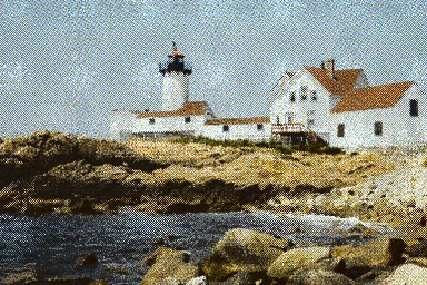
Reusable cards for playground entries and experiments. Media can use images, generated previews, or video.
Motion
Interaction rules for press feedback, hover, easing, and reduced-motion support.
Press Feedback
Buttons scale to 0.97 on press. Linked artifact cards scale to 0.99. Transform only, 150ms, var(--ease-out).
Fine-Pointer Hover
Decorative hovers (nav color, card glow) use the pointer-fine: variant — gated to @media (hover: hover) and (pointer: fine). Touch taps do not leave sticky hover states.
Easing Tokens
Click a curve to pause or resume the loop. The dot moves at linear time while following the easing output.
Reduced Motion
When prefers-reduced-motion: reduce is set, press transforms and decorative hover glows are disabled. Color and opacity transitions remain for comprehension. Tab indicator motion is disabled.